Case Study
WyshKit
Quick commerce gifting marketplace — personalised gifts delivered in 40 minutes, with a pay-first customisation flow that changes everything.

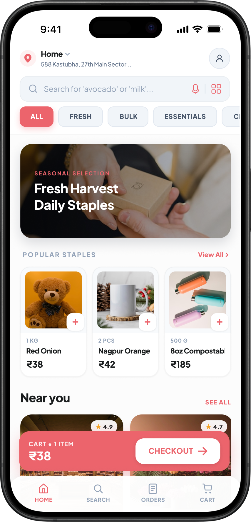

Quick commerce gifting marketplace — personalised gifts delivered in 40 minutes, with a pay-first customisation flow that changes everything.
WyshKit is a quick commerce gifting marketplace for India — fusing Swiggy-like vendor discovery with gifting-specific curation and personalisation. It enables seamless B2C experiences for personalised gifts, hampers, and bulk orders, with 40-minute hyperlocal delivery.
I owned the end-to-end product design — from the discovery experience and cross-listing architecture to the checkout flow, order tracking, and the customisation pipeline. The goal was to build a platform where vendors expand offerings without inventory ownership, and users get authentic, personalised gifts delivered at quick-commerce speed.
India's gifting market is valued at $92B by 2030, but traditional platforms (FNP, IGP) lag with delays. Quick commerce is booming ($57B) via Blinkit — but none focus on personalized gifting with vendor curation.
End-to-end product design for a mobile marketplace — vendor discovery, product detail pages, the personalisation-to-preview pipeline, checkout, order tracking, feedback loops, and the design system.
Pay first, preview after — a counterintuitive order flow that filters out uncommitted buyers before they enter the customisation loop, reducing vendor effort and making the pipeline predictable.
In the traditional gifting model, personalisation is manual and expensive. Clients request customisation, vendors create samples, revisions go back and forth — and many orders drop off during this cycle. The process doesn't scale.
I redesigned the order flow so payment happens before the preview. This single decision filtered out uncommitted buyers, reduced unnecessary vendor iterations, and created a predictable order pipeline.
 Payment before preview
 Share details post-payment
Preview — approve or revise
Share details post-payment
Preview — approve or revise
 Live tracking → delivery
Only paid customers enter the customisation loop. Vendors no longer waste effort on uncommitted browsers — every preview request has a committed buyer behind it.
With financial commitment upfront, customers provide clear, complete requirements. Back-and-forth decreased significantly — most orders approved on first or second preview.
Revenue is locked before production starts. Vendors can forecast workload accurately, and the platform has cleaner order tracking and fulfilment metrics.
Every screen maps back to a product decision. The design follows how users think — discover, evaluate, commit, customise, track, review.
Search shows nearest vendors first. Products appear from their own listings or cross-listed brand catalogue. Category filters (Fresh, Bulk, Essentials) mirror how users actually shop for gifts — by occasion and type, not by SKU.
Home — nearest vendors, categories, seasonal picks
 Address selection — hyperlocal context
Vendor storefront — curated product grid
Address selection — hyperlocal context
Vendor storefront — curated product grid
The PDP borrows from Zepto's swipeable image pattern but adds gifting-specific elements: gift wrapping (+₹50), custom message card (+₹15). A key design choice — the info callout clearly states "details will be collected after payment," setting expectations early for the pay-first flow.
 PDP — product images, pricing, delivery ETA
 Personalisation options — gift wrap, custom card
 Search — recent queries, product and brand search
This is where the pay-first model comes alive. The checkout shows order summary, delivery address, and payment methods. Bill details include platform fee, delivery, and WyshCredits — modelled after Blinkit's pricing transparency. 100% advance for custom/bulk orders — no COD.
Checkout — order summary, address, payment
 Payment methods — UPI, cards, wallets, COD
 Bill details — GSTIN, estimates, credits
After payment, the user enters the customisation pipeline. They share engraving text, reference photos, and logos. The vendor creates a digital preview ("Elite Handshake"). Users approve or request a single revision — all within the order tracking timeline. A timer enforces priority production SLAs.
 Order confirmed — vendor acknowledged
Share details — name, photo upload
Order confirmed — vendor acknowledged
Share details — name, photo upload
 Details submitted — photo uploaded
Preview review — approve or revise
Details submitted — photo uploaded
Preview review — approve or revise
 Revision request — describe changes
Live tracking — out for delivery
Revision request — describe changes
Live tracking — out for delivery
Post-delivery, users rate each item and answer an accuracy query: "Did it match your preview?" This creates a quality signal for vendor accountability and fuels the WyshCredits rewards system (₹50–₹250 based on order value). It also validates whether the pay-first model actually delivers the right outcomes.
 Delivered — accuracy query + item rating
 Full feedback — vendor service + delivery
The orders screen surfaces real-time status badges — "Share Details," "Preparing," "Handshake Review" — directly on order cards. Users can track, reorder, or download invoices without navigating deep. Progress bars show where each order sits in the pipeline.
 Active orders — status badges, progress bars
 Past orders — reorder, invoice download
The account page surfaces WyshCredits balance prominently — a retention mechanism where post-feedback credits (₹50–₹250) drive repeat purchases. Settings are cleanly grouped with descriptive subtext, following conventions from Swiggy and Blinkit.
 Account — Elite Member, ₹150 WyshCredits
 Address form — structured for hyperlocal delivery
Every feature decision traced back to a user need or business constraint. Here's what I prioritised — and why.
Showing nearest vendors first (like Swiggy) builds trust through locality and "100% Authentic" badges. Cross-listing details hidden from UI — users don't need to know if a Boat speaker comes via a gifting vendor. They need to trust it's authentic.
By collecting customisation inputs post-payment, we ensured only committed customers enter the vendor's production queue. This isn't about locking users in — it's about respecting vendor effort and making the pipeline scalable.
Independent vendor tabs for parallel cart management. No preview blocking — users can continue shopping while one vendor prepares a preview. Partial or consolidated checkout, modelled after how Swiggy handles multiple restaurant orders.
Post-delivery credits (₹50 for ₹5K+, ₹100 for ₹15K+, ₹250 for ₹50K+) serve a dual purpose: incentivise repeat orders and drive feedback that holds vendors accountable. The "Did it match your preview?" query is the quality anchor.
The pay-first model wasn't just a design choice — it was an operational decision that reshaped how the business works. Here's what it enabled.
Vendors no longer invest effort in uncommitted customers. Every customisation request now has a paid order behind it — the production queue is clean and predictable.
By moving payment before the preview, the traditional drop-off point is eliminated. Customers who pay are invested — they complete the loop.
The digital preview system (Elite Handshake) with structured approve/revise actions replaces manual back-and-forth. It works at any order volume — not just the first 10 vendors.
Revenue is locked before production starts. Realistic success rates of 93–98% (comparable to Zomato's 95% order completion) with clear tracking of drop-offs from stock-outs (2–3%) or preview delays (1–2%).
The smartest design decision was making payment the gateway to personalisation — not the other way around.
This single choice made everything downstream predictable.